ExtensionsFree
MCP Connector
by ppatooCalagopus Model Context Protocol (MCP) Connector Extension - 26 Management Tools
No ratings yet
Original panel theme, layout customizer, and UI enhancement layer for Calagopus Panel
Original panel theme, layout customizer, and UI enhancement layer for Calagopus Panel
Clarity Theme & UI Enhancement Layer Clarity is an original, clean-room panel theme, layout customizer, and UI enhancement layer built from scratch for the Calagopus Panel. It provides responsive navigation modes, high-contrast accessible visual styling, real-time server telemetry HUD, and operator-controlled default layout preferences without modifying core panel source code. --- 1. Ground Truth & Compatibility • Calagopus Panel Version: >=1.2.8 • Target Repository: https://github.com/calagopus/panel (MIT) • Target Git Commit SHA: f89411e9b51273d4a6be0c534927b799a7fd448f • Rust Toolchain: rustc 1.99.0+ (Workspace Edition: 2024) • Node.js: >=24.0.0 • pnpm: >=11.0.0 • License: MIT (100% original code; no commercial assets, external trackers, or licensing locks) --- 2. Package Identity • Package Name: dev.antigravity.clarity (Canonical 3-segment identity) • Identifier / Crate Name: devantigravityclarity • Display Name: Clarity Theme & UI • Authors: Antigravity • Release Version: 1.0.0 --- 3. Layered Theme Architecture Clarity strictly adheres to the Calagopus extension hierarchy, applying visual modifications at the broadest and cleanest level possible: Layer A — Mantine Theme (frontend/src/theme.ts) • Returns partial MantineThemeOverride deep-merged by Calagopus. • Defines custom 10-shade color palettes: • clarity: High-visibility cyan/teal primary scale [0..9]. • clarityDark: Obsidian/slate neutral scale [0..9] for background surfaces. • Configures defaultRadius: 'md' across Buttons, Cards, Modals, and Inputs. Layer B — Scoped CSS Variables (frontend/src/app.css) • Strict scoping under :root[data-mantine-color-scheme="dark"] and :root[data-mantine-color-scheme="light"] (bare :root is avoided so Calagopus scheme selectors do not override custom values). • Controls system metrics and dashboard colors: • --mantine-color-body • --chart-grid-color, --chart-tick-color, --chart-series-1..4 • --color-server-status-running, --color-server-status-starting, --color-server-status-stopping, --color-server-status-offline • --font-sans Layer C — CSS Variable Resolver (frontend/src/resolver.ts) • Implements initializeMantineCssResolver(ctx). • Derived values gracefully activate when Clarity is the active resolver, with full fallback to Layer B CSS rules if another extension mounts a resolver. Layer D — Hookable Component Interceptors (frontend/src/layout/applyLayoutHooks.tsx) • Registered purely in initialize(ctx) during extension bootstrapping. • Never called dynamically inside React renders or handlers to prevent interceptor accumulation. • Wraps Sidebar, ServerContentContainer, AccountContentContainer, and AdminContentContainer with layout data attributes for responsive CSS container queries. Layer E — File Overrides (frontend/src/overrides.ts) • Intentionally Unused: Zero core panel files are overridden, ensuring 100% update-safety and zero collision risk with other extensions. --- 4. Layout System & Studio Clarity features a modular Layout System that lets users and operators tailor their navigation and content presentation: Navigation Modes 1. Left Sidebar (left-sidebar): Standard desktop sidebar with enhanced clarity contrast. 2. Top Bar (top-bar): Horizontal top-navigation header with flexible responsive wrapping. 3. Collapsed Drawer (collapsed-drawer): Minimalist icon dock that slides open on demand. Container Modes 1. Inset (inset): Standard centered container with generous padding. 2. Flush (flush): Edge-to-edge full bleed layout for console terminals, file managers, and large data tables. Responsive Breakpoints Breakpoints use @container page (max-width: ...) container queries matching Calagopus's frontend/src/breakpoints.css, ensuring layouts adapt correctly when embedded inside resizable panes or split-screen views at 360px, 768px, and 1280px. --- 5. Backend Architecture (Rust) Implemented in src/lib.rs and src/settings.rs: • Operator Settings: • ClarityOperatorSettings serialized and deserialized using SettingsSerializeExt and SettingsDeserializeExt. • Fail-safe deserialization: malformed or missing keys automatically fall back to safe defaults without failing panel startup. • Index HTML Boot Variables: • Registered in initializeindexhtml under the settings read lock. • Exposes accentcolor and brandname to pre-render the loading screen (frontend/src/boot.html) before React mounts. • Admin REST API: • GET /api/admin/extensions/dev.antigravity.clarity/settings: Fetches current global defaults. • PUT /api/admin/extensions/dev.antigravity.clarity/settings: Mutates operator settings with garde payload validation, clarity.settings-write permission enforcement, and audit activity logging. • RBAC Permissions: • clarity.settings-read: Read operator settings in Admin UI. • clarity.settings-write: Modify operator settings in Admin UI. • clarity.view: View server telemetry metrics HUD. • clarity.customize: Toggle server-level layout customizations. --- 6. Installation & Deployment Quick Install with Pre-built Package Developing & Building from Source --- 7. Update Procedure --- 8. Rollback & Uninstallation If you wish to remove Clarity and restore vanilla Calagopus styling: All standard user settings under the dev.antigravity.clarity:: namespace will remain safely dormant and do not impact core panel functionality. --- 9. Verification & Test Suite Summary • Backend Rust Tests: 4/4 passed (cargo test -p devantigravityclarity). • Frontend Unit Tests: 5/5 passed (layout.test.ts). • TypeScript: Strict typechecking passed with 0 errors (pnpm typecheck). • Linter & Formatter: Biome check passed with 0 errors (biome check). • Cargo Clippy: Strict checks passed with 0 warnings. • Export Packaging: Official panel-rs extensions export passed all automated pre-export checks.
Calagopus Model Context Protocol (MCP) Connector Extension - 26 Management Tools
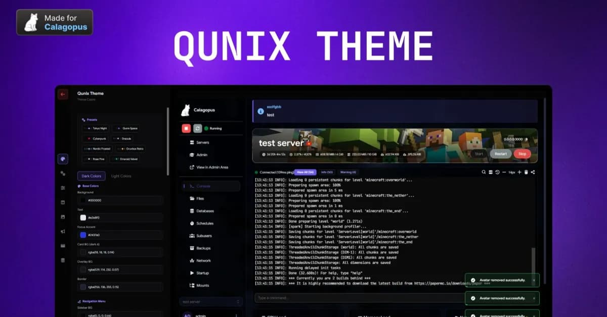
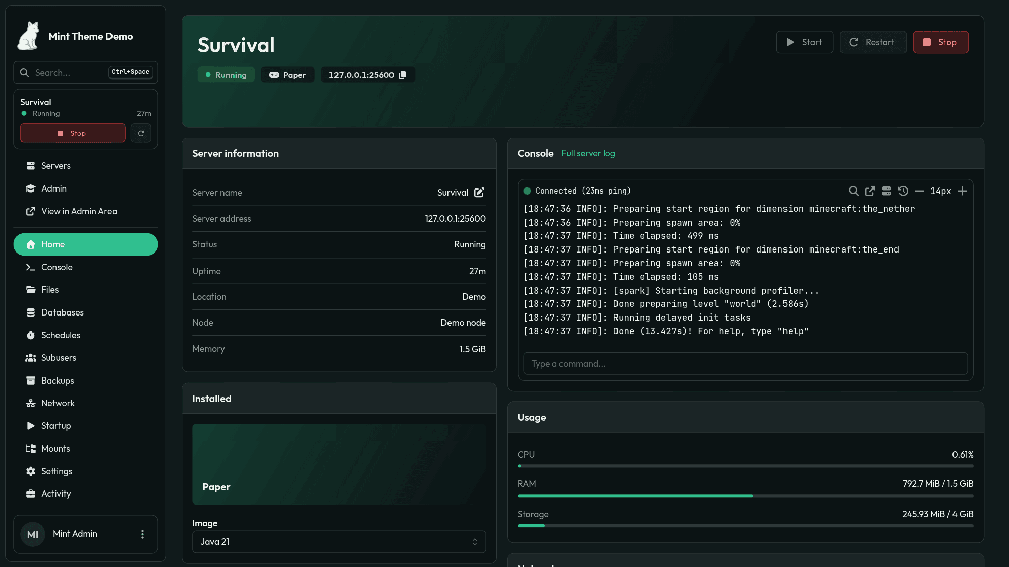
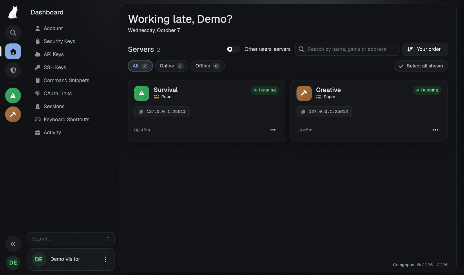
Zoron Theme: a Calagopus panel theme with an icon rail, a console workspace and a live theme studio
Pick a single brand color and instantly generate a complete panel theme. Supports dark/light mode